Riverview Therapy
brief
Jennifer, the owner of Riverview Therapy, came to DigiSage for help marketing her new practice—starting with developing a brand image. Jennifer has thirty years of experience as a therapist, so she knew she wanted her brand to convey her humanistic, non-judgmental, accepting approach. That feeling, paired with her river-adjacent office, informed the colors and shapes DigiSage used in her new logo: a heron, standing in flowing water and surrounded by a fluid circle. The heron is designed to evoke feelings of being lighter and uplifted, while the flowing water symbolizes forward movement, growth, and fluidity. The circle conveys a feeling of connectedness, and the colors—blues, greens, and golds—convey a sense of warmth and comfort.
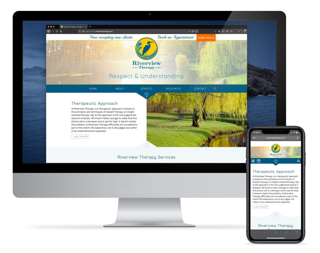
Following the creation of the logo, we created a two-sided rack card which provides a high level overview of Jennifer’s approach and services. In addition, we custom-designed and developed a website which includes additional information about Jennifer, her approach and services, and a resource section where Jennifer offers useful information about therapy, marriage, divorce, etc.
Jennifer’s marketing materials are characterized by a sophisticated yet approachable design, with little details to provide added visual interest. The focus is on making prospective clients feel safe and comfortable.
Services Provided
- Design
- Logo
- Website
Design

Logo
Website


